
A 64-Piece Box of Heaven
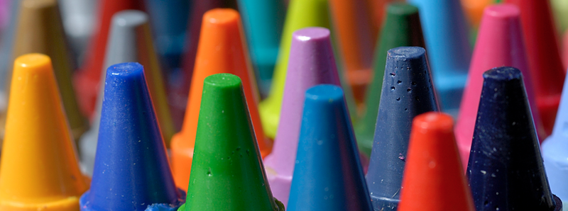
We’re slowly opening up that brand new box of crayons was a special moment? All the choices – fingers hovering over the 64 different hues – which one to pick up first? And the smell – mmmmm fresh, new, so many possibilities.
Humans respond deeply to color. It has the power to influence our moods, ignite ideas and emote feelings.
Relationship with color starts very early in life. Who hasn’t met that little girl who will only wear purple shoes, eat only purple food (very limited choices here) and begs you to paint her bedroom walls the same shade as her Disney princess dress? (Oh Walt, you genius!)
Sometimes it’s hard to explain why we’re drawn to a particular color. It could be a connection to a good memory. Perhaps someone we care deeply about loves that certain shade of blue.
When my son was very young, he used to color with only the black crayon. I watched and wondered if this meant some deep-rooted sadness, was he angry, was he destined to live a life of crime?
I tried offering him alternatives, bright greens, soft yellows, cheery reds. No deal.
I finally asked him why he would only color with the black crayon. He looked up at me a little perplexed at my question and responded: “Because black shows up the best!” An aha parenting moment if their ever was one.
Colorful Quotes….
Color is one of the most important aspects of design. Here’s how a few of our Design Match designers feel:
“Color communicates meaning and draws attention to an interior.
As an Interior Designer, color is an element of design that I use to
set a tone for a room.” DM Designer Cathy
“If there is a painting to be featured in the room, it is used as a guide and colors
are referenced from it to create a color scheme.
For instance, there are many shades of green. Selecting one that compliments the picture, rather than competes, is key. Complimentary colors are used to carefully emphasize the picture or section of a room, such as an accent wall. Only then will the room and painting be united and give rise to the intended human emotion.”
Look into my crystal ball….
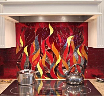
We at Design Match see a bold trend slowly surfacing in home decor. “RED” Red in its many different hues. Yellow-based reds and blue-based reds. Keep your eyes open – you’re going see this primary rock star used by design professionals in ways so creative it will blow your mind.
Here’s an amazing backsplash by DM Designer Diane. She worked with her client to select each shade of glass tile to reflect the client’s idea of what flames look like. Talk about great communication!
Choosing the right combination of colors for your home can be scary. Having a great relationship with the perfect design partner will make your life easier and a lot more fun.
Your designer will help you choose the right shade of paint or fabric. They have the expertise to know what different colors look like during the day, in the evening or, if you dare, splashed all over the walls in your dining room.
“You often hear ‘it’s just color!’ – but just one drop of the wrong pigment can give
your walls an undesired undertone. Consult with an expert design professional.”
DM Designer Diane.
Just like Stella,….
Get your color groove back. Grab one of those coloring books for adults and start waking up your inner crayon-crazy child.
Slowly open that box and breathe deep….. As always, we love to hear from you. Send us your colorful tales and we’ll publish some of them.
Are you thinking of changing the color scheme in your home? Contact us to help you find the right design professional to assist you in making the perfect color choices.

